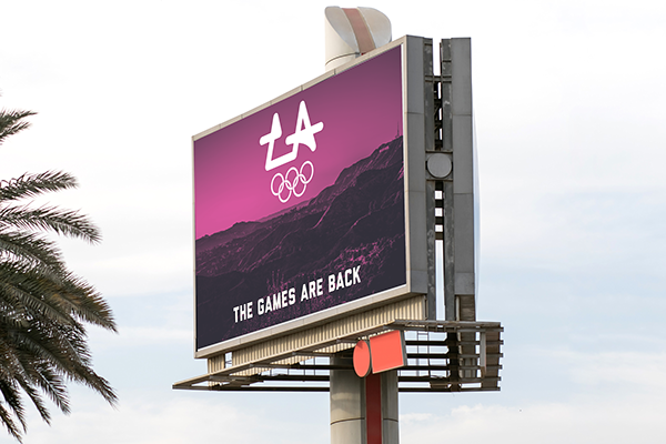
Branding an event like the Olympics is an exercise in distilling an entire city into a simple design system. It's a chance for a city to put on the best show they can for the world to watch, and the branding of the event should show what makes a city unique.
Research & Inspiration

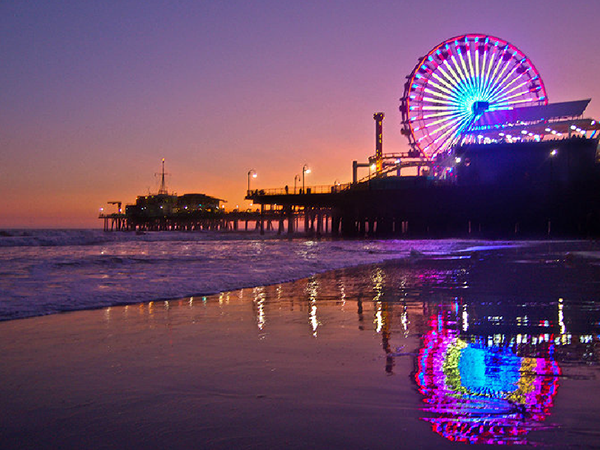
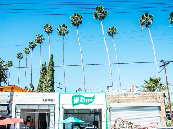
The hardest part of branding a city like LA isn't a lack of inspiration to draw from, but having too much. Los Angeles' citizens draw their ancestry from all corners of the world, the city is surrounded by a varied natural landscape that ranges from beaches to mountains to deserts, and its industries range from entertainment to manufacturing. I decided that using a "LA" monogram was the simplest way to represent the city as a whole.
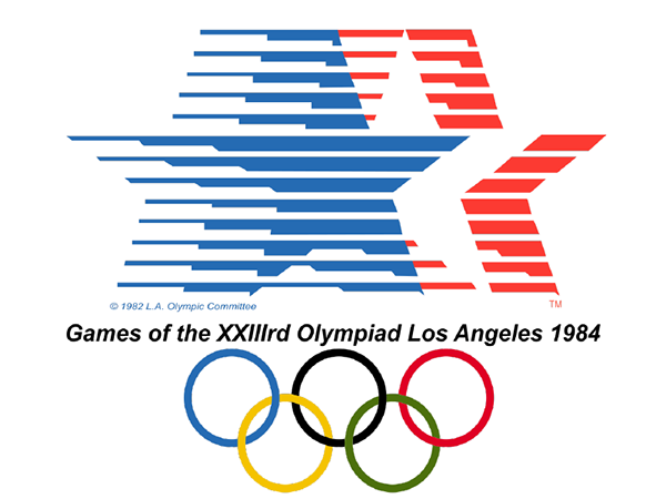
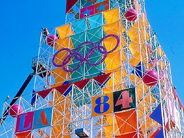
I researched the 1984 LA games and learned how they turned the Olympics into a city-wide festival with bright colors and environmental design. I wanted to create a design system that could be used in a similar way.
Logo Design
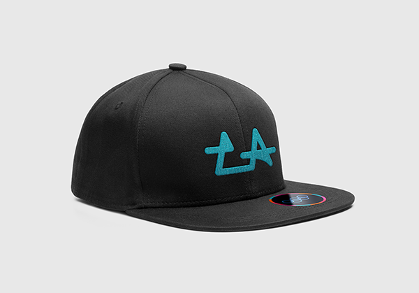
The final logo was created using the star shapes of the LA 84 games logo to create an LA monogram. I used a bright color scheme similar to the 1984 games based on the colors of an ocean sunset.
Pictograms
Icons for the different Olympic events are essential for international visitors who don’t speak the language. They need to be simple and distinguishable. I used a basic stick figure form and color-coded the icons based on what part of the city the event was taking place. I wanted the logo and the icons to fit well together, so I used the same rounded lines and gave the border a small drop to match the drop in the “LA” logo.
Tickets
Design in Use
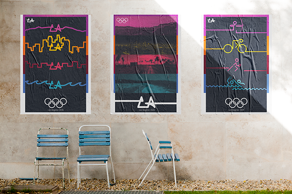
A set of 3 postgers, made to show the diversity of LA and the Olympic Games.
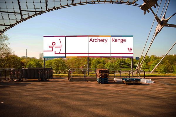
LA is a city that grows outward, not upward. The same is true of these design elements.
